


Magazine

The Need
Over the years Shufrsal created several blogs and brands that offer content such as tips, recipes, and articles. The main problem they encountered was with maintaining so many different websites, it wasn't scalable, and managing them all was wasting too much time. Another issue was that with so many different blogs and brands, with no connection between them, the users might not connect it to Shufersal and they also don't get a great cohesive experience.
The Idea
Creating one online magazine where they can easily manage all of their content in one place, and give it all a new modern and cohesive look. The magazine has to be designed so that it can cover many different topics, so that it can grow with the company as they create new content and enter new industries. With so much content, from various different topics, it was important to make it clear clean and easy to navigate. We also didn't want to completely lose the old brands and blog names, as some of them already had many followers and brand recognition.
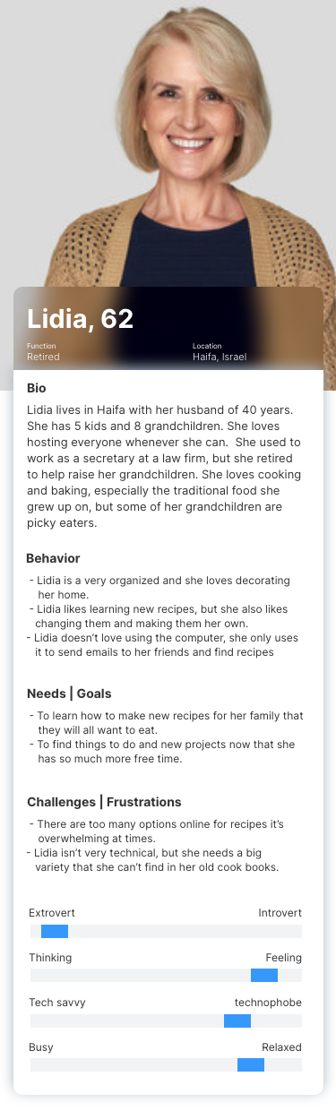
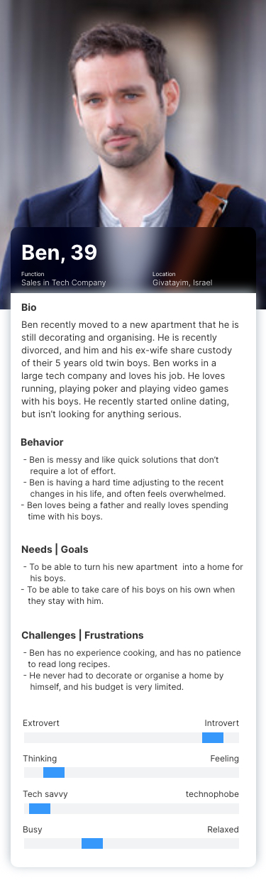
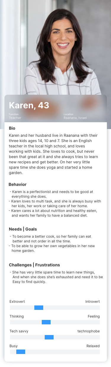
The Users
The magazine will be visited by many different types of users, as it contains a lot of content from various topics, such as cooking, home design and decor, babies, beauty, farming, and so on. Each blog brings in its own crowd of followers from before, and the new magazine will try to attract new users as well to each topic and to the magazine as a whole.
The main focus of the magazine is still the cooking topics, as it brings the company the most value but we know that the users are not only using the magazine to find recipes, and we need to think about all the ways that the magazine can bring them value.
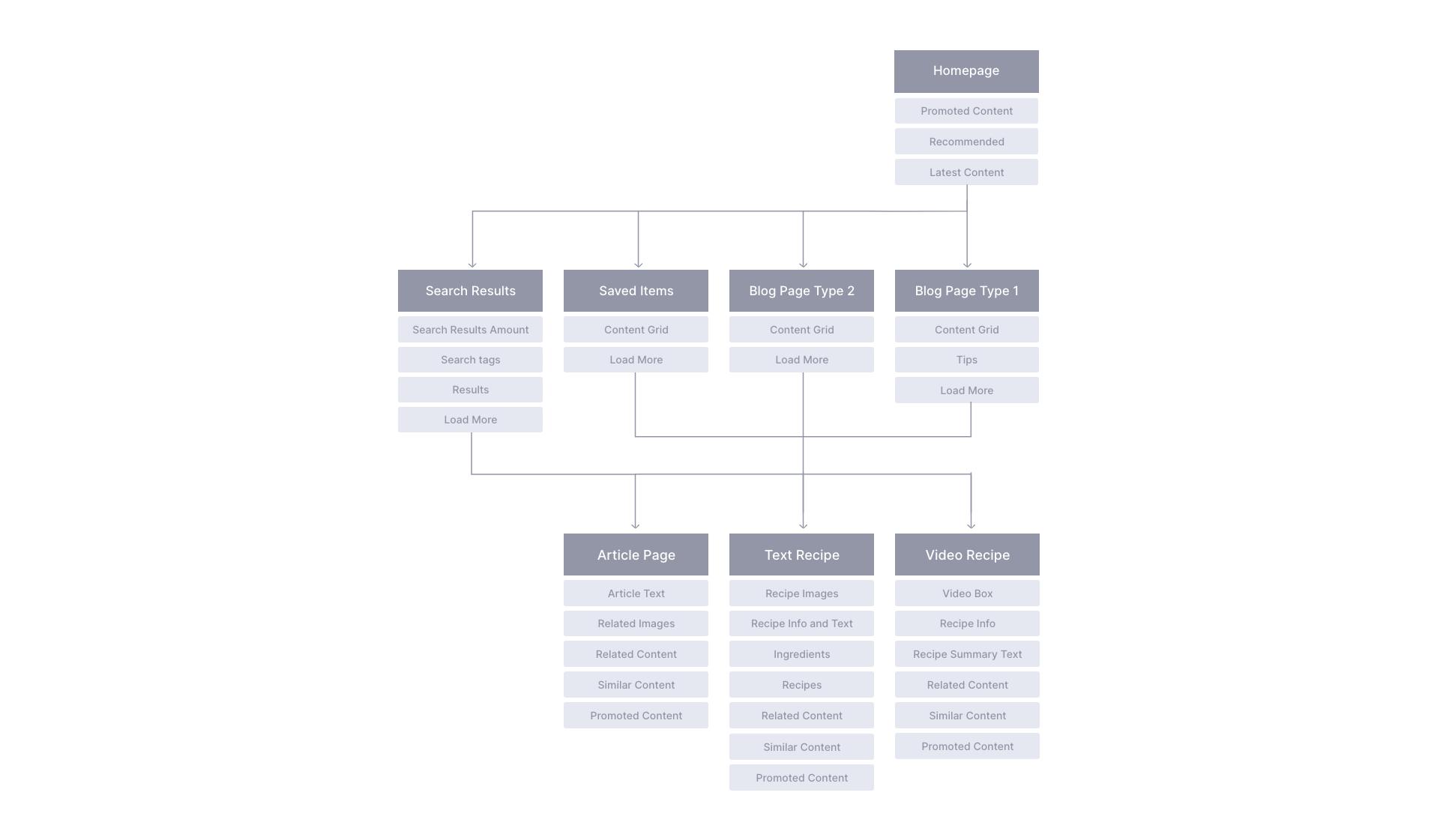
Mapping The Screens
Wireframing
The most important thing to me when planing these pages was to keep the structure simple, and not using too many patterns, so it will be easy to add new topics and new content, as this website keeps evolving and new content is added daily. I also wanted to put an emphasis on the images, as they give the website the magazine-like feel, and also because it makes it easier for the users to scan a lot of content quickly. That is also why I wanted to use a tagging system, so that the users can easily scan for the topics and type of content they need, without separating the content by topics on each page.
Visual Design & Branding
Shufersal's brand had to be incorporated into the magazine, but I also had to keep each blog/content's brand with a separate look and logo. To not create too much chaos and confusion, I stripped the branding of the different blogs/content to their base and created a more cohesive design without completely losing their uniqueness.
I wanted the design of this online magazine to promote the following concepts: current, lavish, accessible, and harmonious. I choose bright and lively colors to give the magazine a young and current look and feel, but kept Shufersal's brand as the connecting thread that holds it all together.
Fonts

Color Palette
Design Tools


The Final product
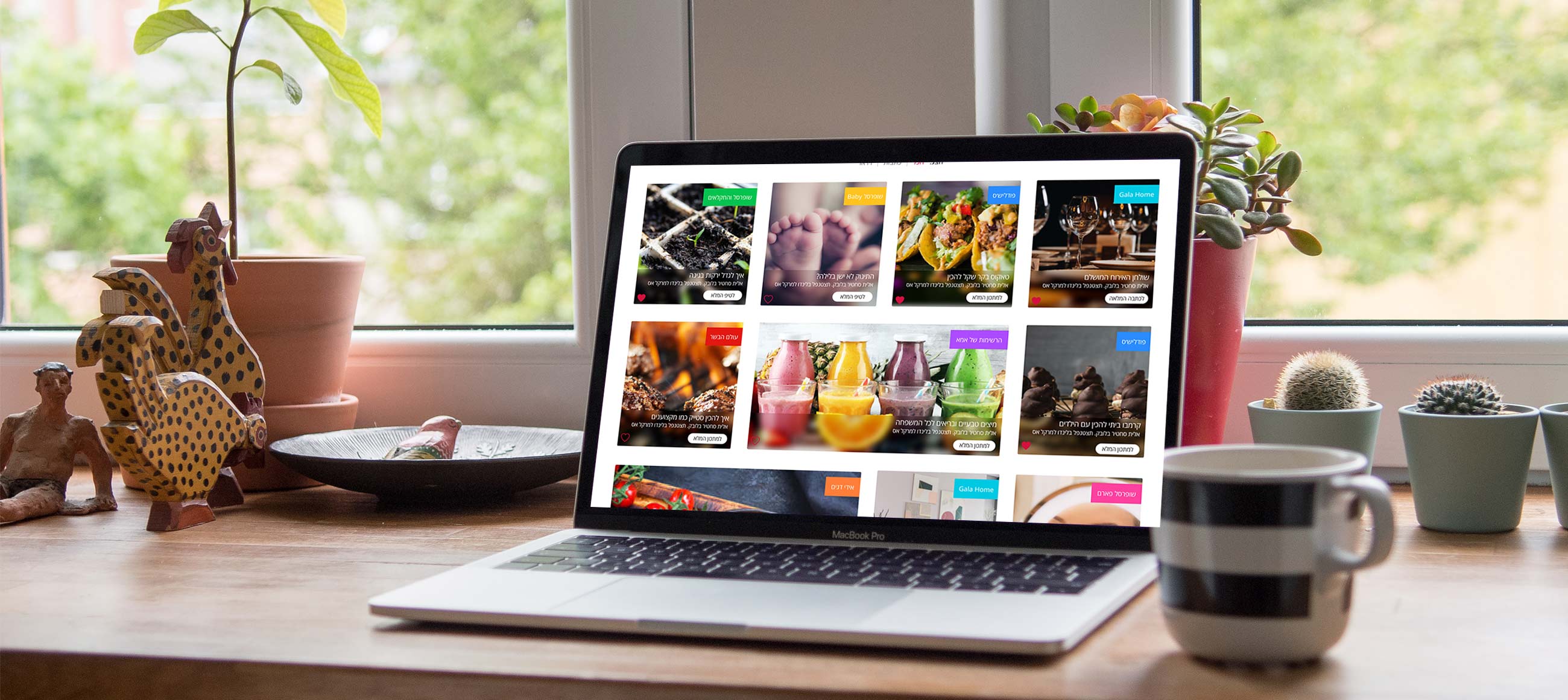
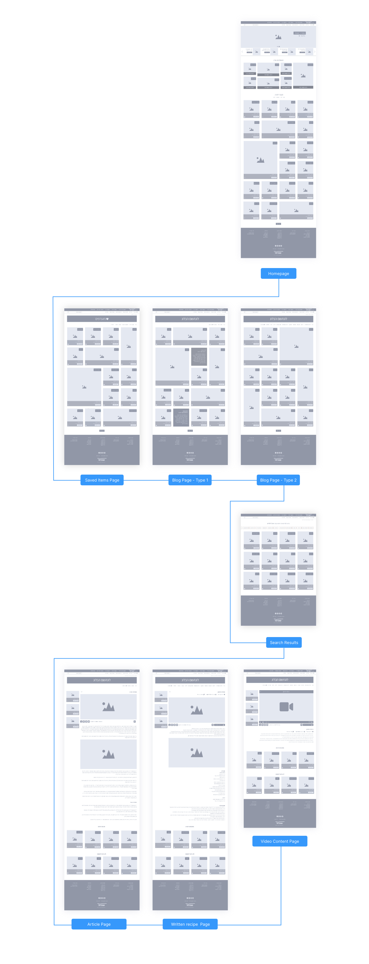
Homepage
The homepage has a few different sections, to both intrigue and excite the different users, as well as to let Shufersal promote the most important content to them at the top of the homepage.
The main section of the page match the inner blog pages, with a similar grid that has different content sizes and shapes. I wanted to make the grid more fund and interesting to the eye, as a long repetitive grid can be boring and monotonous.
The Different Sections
I wanted to create a more cohesive look to the magazine as a whole, but since we were combining a few different exhibiting blogs I wanted the users to be able to visually differentiate between them. My solution was to keep the logos of those who had logos that the users were familiar with, and to give each topic/blog its own color. This lets the users quickly identify the different topics, but gives the magazine a unified look as one complete magazine.
Hierarchical Levels
There is a lot of content in this online magazine, so the magazine is built in such a way that you can get to the same content in different ways, this was done to make it easier for the users to find what they need easily and quickly.
There is a hierarchy to the content, but the user doesn't need to go through the hierarchy to get to the specific article or recipe. The hierarchy structure simply lets us keep the content organized and labled correctly.
Recipes & Articles
In the end, what the users want is the specific article or recipe, and that is their journey "destination". However, we want them to keep going in their journey of our site, so each content page also connects them to other recipes and articles that support the one they choose. They also have similar content and recommended content on the page. The goal is to keep the users going from one piece of content to the next, and we give them a few different options to do so.
On each article or recipe, they can also share the content with others, and connect to Shufrsal's online shopping site to buy relevant products.
Search Screen
The search page is an integral element in the magazine, as I found that most users that visit the different blogs are searching for something specific. I wanted the users to be able to find things easily using our search bar so I placed it in a prominent location in the header. I also wanted it to be easy to quickly narrow the search result by type of content, or by selecting a more specific related term, similar to a google search.
Takeaways from this project
When dealing with a big brand like Shufrsal, which has such strong brand recognition and a set way of doing things, you need to find the balance between the old and the new and you have to remember that part of your job is making the client happy. I was lucky to work with great people in Shufersal on this project that really believed in making a change, but it was important to keep the magazine connected to the rest of the brand.
Another interesting challenge I had in this project was that we combined such different blogs, that attracted very different users and I needed to make sure we give the best experience to each demographic without compromising the others or our vision. My main goal was to look for the connections not the differences between the different users.
